223: UK House Price Maps - crash, boom, negative equity, income...
09-14-2008
PropertyInvesting.net team
We thought our visitors would probably appreciate viewing the house price maps available for your analysis of which areas, regions and town are suffering the most and which areas may survive better than most in the current market downturn. You should be able to absorb this data to judge whether are particlar area is at risk or not. We hope you find these maps helpful to build into your property investment strategies.
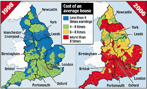
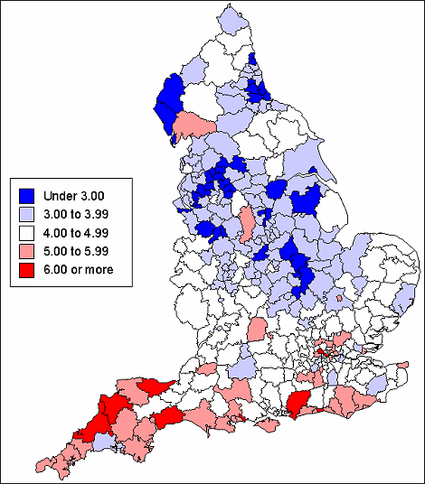
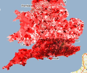
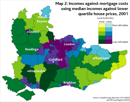
House Price to Income map of England
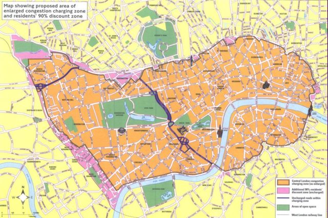
London Congestion Charge Map
d
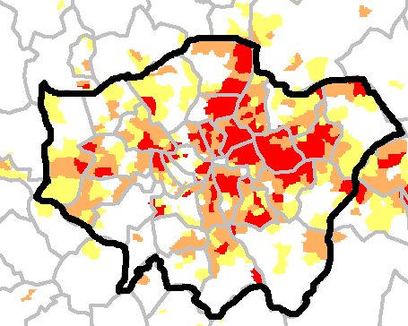
London Deprived Area Map
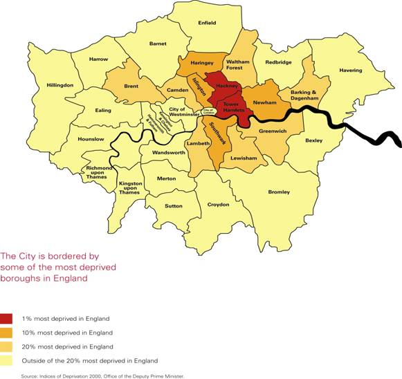
London Poverty Map
d
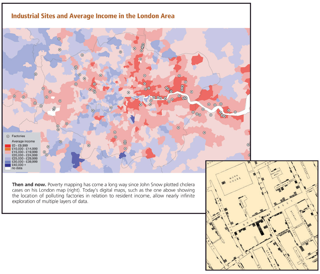
London Income Map and Industrial Site - note correlation between industry and income - For the curious the dark blue patch to the SW of London is sleepy Leatherhead-Ashtead. No industry, only service sector jobs and commuters into Waterloo
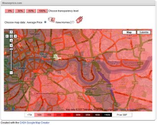
Property Heat map East London available from www.Mouseprice.com
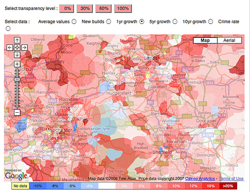
Property heat map Bradford to Manchester region available from www.Mouseprice.com
Property Heat Map of the UK from www.Mouseprice.com
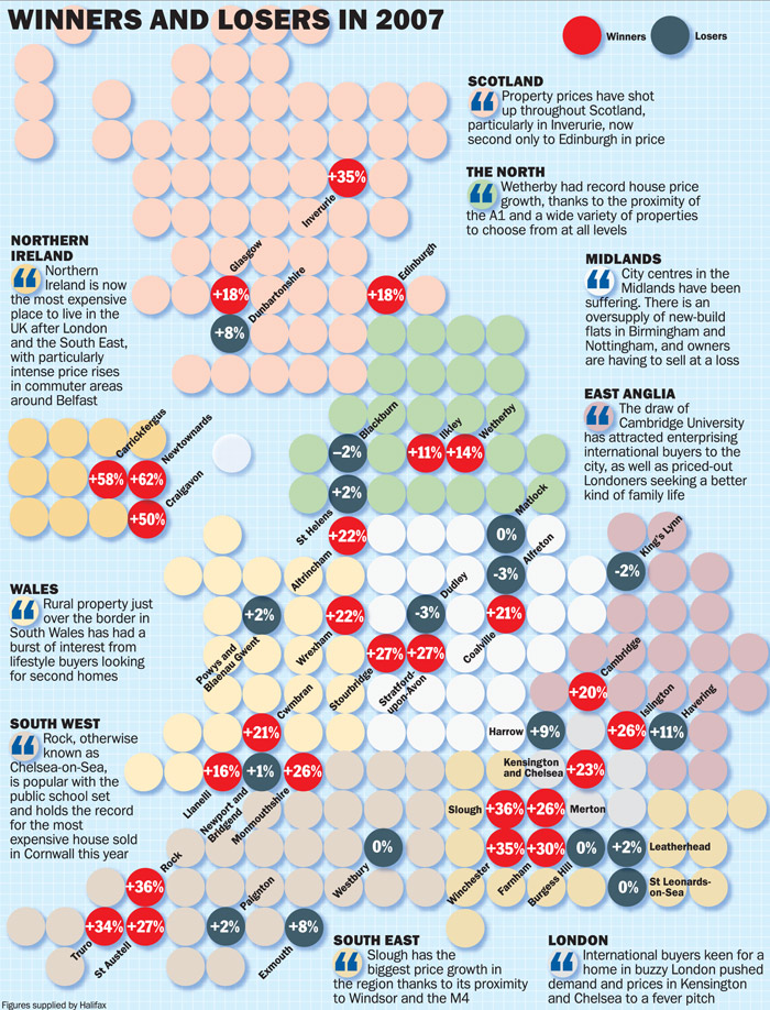
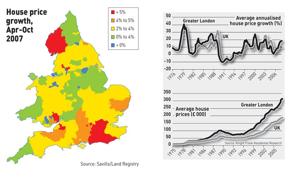
House Price map - Boom (winners) and Stagnation (Losers) in 2007
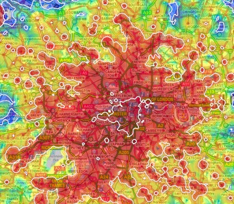
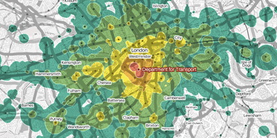
London travel time map - also has a fairly large impact on London's house prices
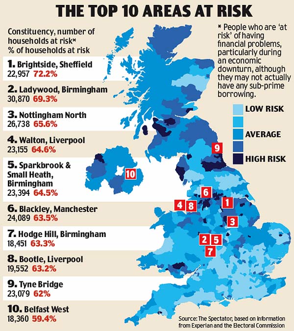
House Price Crash Risk (Spectator) - most at risk areas for price corrections
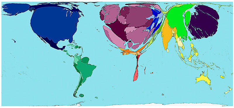
World House Price asset value - described by area - note how large the UK is compared to the population and geographic area of the country
London Travel
London Travel Time Map
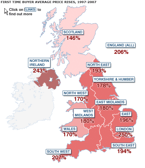
First Time Buyer Average Price Rises 1997-2007
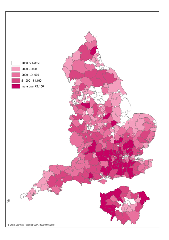
Council Tax Map
d
House Price Hotspots - Boom Map April to Oct 2007 in UK (London and the SE and Cumbria were hotspots)
London and SE England Incomes against mortage costs (2001)
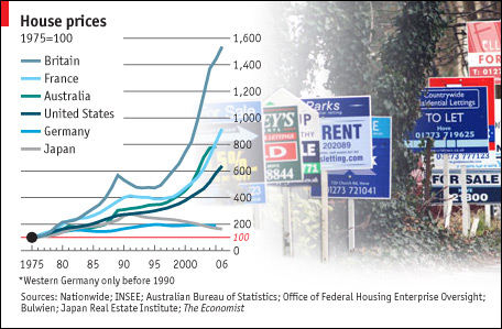
House Price Boom in UK, France and other countries - www.economist.com
For UK investors, one look at this chart is enough to give the spooks. Especilly when compared with Germany and USA.
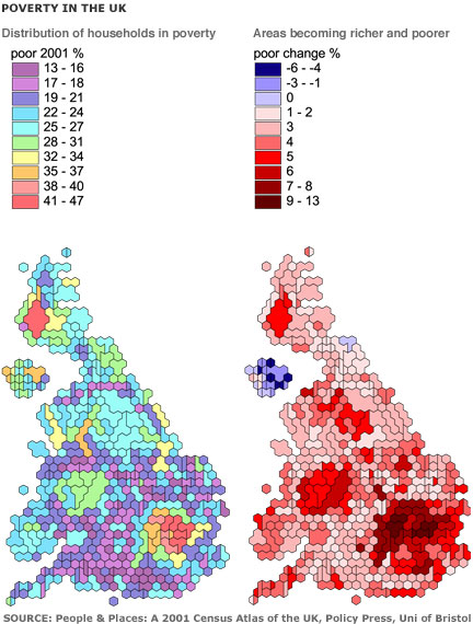
Poverty in the UK Map
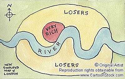
London Map - Very Rich (Chelsea, Kensington, Mayfair) and the rest! Same today as it was in 1800. We - one day may be we will live in the Very Rich part - we've alway fancied a flat in Mayfair (can't get much better - no wander it's so expensive - it's a such super place...)
London Tube Map
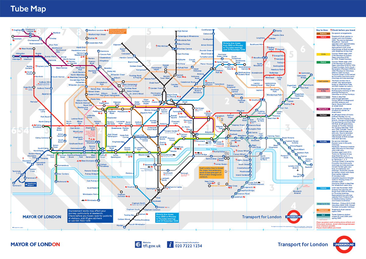
London Tube Map
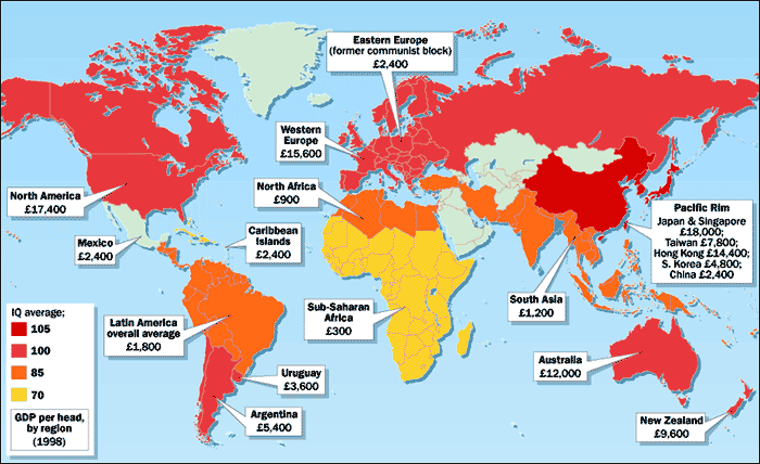
IQ Map of the World - for your interest - frankly we're not sure whether this map has any merits but its of interest all the same. It compares incomes versus IQ. In theory, the higher the income, the better the education and the higher the IQ (and higher the house prices). This is going a bit far we admit, but education is a key factor in both incomes/business and hence house prices.
One interesting observation though is that China has a relatively low income but the highest IQ - so expect house prices in China too shoot up in the next 20 years as the country industrialises - the improving eduation, hard work and new business will benefit the country hugely.
Tourist Map London
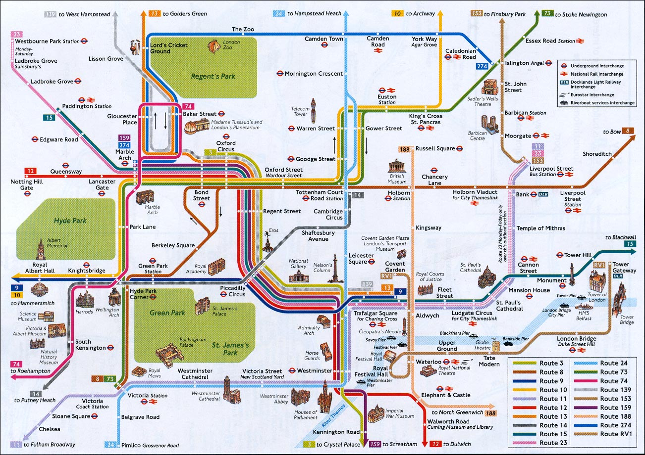
Map
London
London Tourist
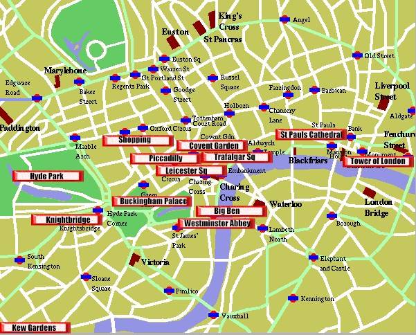
Map
London Street Map for Tourists
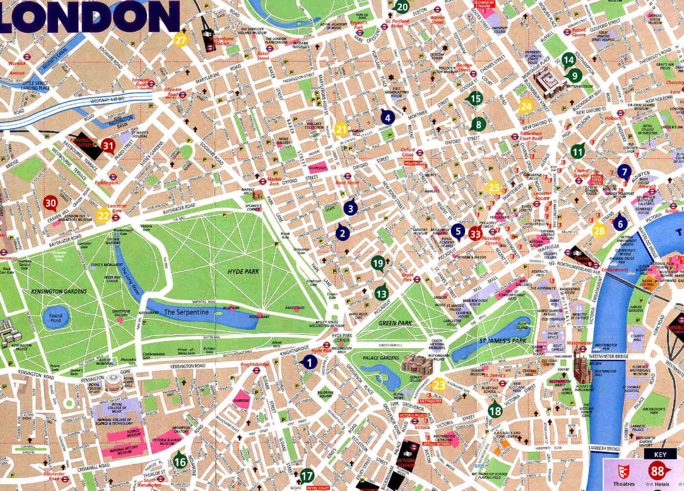
d
House Price Averages UK
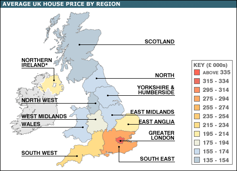
d
Rail Map London
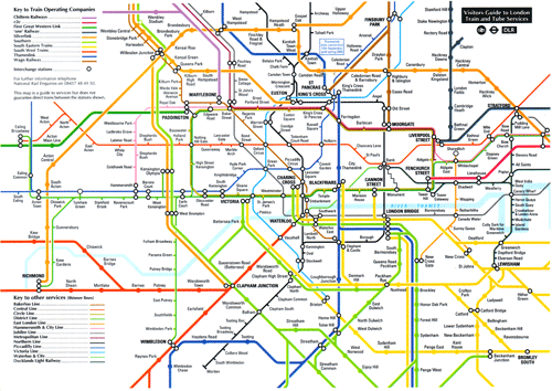
Map
London Underground Map

s
Tube Map
www.google.co.uk www.google.com

